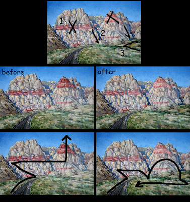
I says: You're probably suffering from a twitchy eyeball brought about by the arbitrarily strong shapes and colors, which all fight discordantly for your attention. Your sensibilities are arguing with the design, which has enslaved your eyes. The eyes unconsciously obey the design they see first, then the brain tries to incorporate what it expects to see. Alas, in this case the eyeballs usually win.
The darkest part of the painting is the road, which draws you up to the darkest rock formation on the center left, which then immediately points your eye up and across the red horizontal band of the left peak, which leaves you at the big red triangle pointing clear off the top of the painting. This is the power of design, bright colors and high contrast draw the eye. It's like tumbling dominoes, one thing leads to another--which is good--you just did it accidentally.
So take back the design! Determine where you want the eye to go, and never encourage it to leave the painting. The viewer's eye should ping-pong around from one thing to another at your discretion and back again. NEVER just hope the viewer can decide what to look at first--always control the eye--heheh, unless it's a Where's Waldo.
1. I'd suggest that you dim out the scarlet in the two large mountains--the horizontal band and peak. REMEMBER! Atmospheric perspective pales and cools things as they go further back. The big strawberry sorbet peak must be robbed of a great deal of its majesty.
2. Then take the linear plunging shadows between the peaks and intensify them, especially at the very base of the foothills, in the grass. This teases the eye back down from wandering too far up the mountains and off into the sky.
3. Lastly, the lumpybumps at the center right-hand horizon line covered in grass need intensity. Given more contrast, they would form a left-facing arrow pointing back toward the bicyclists. All this together completes a clockwise optical journey from the bicyclists, over the peaks, down and across the grass and back down to the bikes. That's how you feel the ride, as well as see it. Oui?

1 comment:
Airybear posted her revised painting here:
http://www.redrockfineart.com/rainbow.html
Show her some love!
Post a Comment