Showing posts with label Illustration. Show all posts

Wednesday, September 26, 2007

Step-by-step

Okay, the creative process for a drug awareness t-shirt design competition. I hear I'm one of only two applicants so far--which means I have the chance of winning two of the three places AND honorable mention if I can think of three more ideas. Lotta pressure.

Here's the sketch. It's not a "real" sketch, it's a really ugly collage. I came up with it by searching good ole Corbis with keywords like "run, race, family, earth" and decided on three images. Two sets of people prancing on the beach, and one globe. I thought hey, these guys have a nice forced perspective thing going on, let's work that. Like...like...they're running on the globe! Yeah, turning the world, baby!

(I love jobs like this, where the first idea is the only idea, it's the best idea and there's no client feedback. Unfortunately, these jobs don't actually exist for money.)


Ta-daa! I assembled the sketch in Photoshop and turned the levels and contrast down, printed a ghost image, traced the outlines with a red pencil, inked it with a handy sharpie and gelly ballpoint and scanned it at 300dpi back into Photoshop. NOT archival. Thusly:


Then I noticed a clear stipulation that you can only have three colors and it has to incorporate the logo. I figured since the logo has some predetermined stuff here I'd just sample color off it and let somebody else worry about where the tints and screens and hooha come into play. It might bite me later, but hey. I've had my shots.


I'm not going to comment on the typography. But there's a book called Stop Stealing Sheep and Find Out How Type Works that elaborates on the unmentionable crimes above.


Voila! Drugs are bad m'kay? Be cool, stay in school! What's your anti-drug?

http://www.whatsyourantidrug.com/
http://www.saynotodrugsrace.org/
http://www.narconon.org/

Tuesday, September 18, 2007

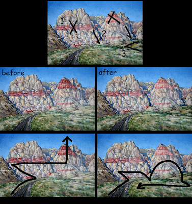
Art First Aid: Rainbow Ridge by Erin Hanson

Erin says: Ok, I should be paying you an artcentergraduate consulting fee... but do help me! it's like, i like the individual parts of the painting, but overall the composition is wrong or somethin...


I says: You're probably suffering from a twitchy eyeball brought about by the arbitrarily strong shapes and colors, which all fight discordantly for your attention. Your sensibilities are arguing with the design, which has enslaved your eyes. The eyes unconsciously obey the design they see first, then the brain tries to incorporate what it expects to see. Alas, in this case the eyeballs usually win.

The darkest part of the painting is the road, which draws you up to the darkest rock formation on the center left, which then immediately points your eye up and across the red horizontal band of the left peak, which leaves you at the big red triangle pointing clear off the top of the painting. This is the power of design, bright colors and high contrast draw the eye. It's like tumbling dominoes, one thing leads to another--which is good--you just did it accidentally.

So take back the design! Determine where you want the eye to go, and never encourage it to leave the painting. The viewer's eye should ping-pong around from one thing to another at your discretion and back again. NEVER just hope the viewer can decide what to look at first--always control the eye--heheh, unless it's a Where's Waldo.

1. I'd suggest that you dim out the scarlet in the two large mountains--the horizontal band and peak. REMEMBER! Atmospheric perspective pales and cools things as they go further back. The big strawberry sorbet peak must be robbed of a great deal of its majesty.

2. Then take the linear plunging shadows between the peaks and intensify them, especially at the very base of the foothills, in the grass. This teases the eye back down from wandering too far up the mountains and off into the sky.

3. Lastly, the lumpybumps at the center right-hand horizon line covered in grass need intensity. Given more contrast, they would form a left-facing arrow pointing back toward the bicyclists. All this together completes a clockwise optical journey from the bicyclists, over the peaks, down and across the grass and back down to the bikes. That's how you feel the ride, as well as see it. Oui?

Monday, September 17, 2007

Fops and Slobbers


This took me something like 3-4 hours to complete for the weekly exercise on http://artjumble.blogspot.com/ (so much fun!)

My refs are below, I get most of my imagery from http://corbis.com/ or http://veer.com/, and if I want to be really sneaky I hunt around on google images and steal from unwitting amateurs. Oh AND sometimes I shoot my own material. If I must.

Remember kids, copying someone else's work is infringement on their rights. This includes every medium and level of professionalism--Photographers and doodlers are people too. If you're going exhibit that sincerest form of flattery by robbing an artist blind, at least credit them where you can. I don't plan on making any money with this image, so hopefully that lets me off the hook.

And it's for edumacational purposes.


Friday, September 14, 2007

Vector vs. Raster, judged by the Norse gods

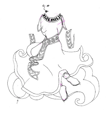
This was a project for FertileGoddess.com, one of several designs slated to adorn a new and improved line of yoga apparel. I drew the top half of Friia by hand and scanned her into Photoshop.

Freehand or Illustrator are better programs for this sort of work, being vector-based and lending themselves to clean lines. But scanners are raster-based to begin with and I'm lazy, so rather than scan it, redraw it, tweak it, I just put it into Photoshop at a high resolution and stay there. Do what I say, not as I do.


Vector Images are generated in illustration programs such as Illustrator or Freehand and are composed of geometry—lines, objects and fills. Because vector elements are mathematically defined, scaling to a larger or smaller size simply requires modification of their parameters. (Something computers love to do--math!) However, vector programs do not adapt well to photographic imagery at all.

Raster Images are broken down into a grid of digital picture elements, called pixels. Scanners, digital cameras, Painter and Photoshop are raster-based. While conversion from vector to raster is easily accomplished, raster to vector is much more hit and miss. (The way it's easy to draw a clean line and smudge it, but harder to un-smudge a once clean line.) Rasterized objects also don't take well to scaling, as the computer is much less adept at assuming and inventing arbitrary color.

SO! I sorta squiggled the dress and belt with the pen tool (using a mouse--I don't have a Wacom tablet either.) Then I printed her out again and traced some more stuff by hand, then scanned that...


THEN I went crazy on it in Photoshop, made some design decisions, thickened the lines and called it good. I sent it to my client, who loves everything I do. I am spoiled.


The End.

Friday, September 7, 2007

Ars longa, Pinup brevis


Every once in a while Art Center posts an honest-to-goodness job I'd want to have. Researching prices for pinup illustrations was hell--apparently they're too good to price themselves online, and too specialized to even bother advertising at all. Or maybe the word "pinup" is dated, and these illustrators/fine artists are using words like "fantasy" or "retro" or something.

Anyway this one took me three hours. I cheat like crazy, using photographs to paint right on top of--I learned it from Richard Keyes at school so take all complaints to him! I know some people actually work for a living, but if it's any consolation I'm writing a book or twelve about what I do to help give other artists a leg up in their lives.

Tuesday, September 4, 2007

Daily Candy

I tried to fake watercolors...I'm not quite there yet but this was pretty good for an afternoon's work. This would be a fun job to have, drawing fashionable girls all day. But I might get bored...

Monday, September 3, 2007

Facepainting


This is my first "realistic" digital painting, it took 4 hours.


I didn't really have a plan, I just thought hey, I bet I could "paint" something in Photoshop and maybe if I was good and fast I could get some hot job as a concept artist for movies and stuff.


I chose a self-portrait because I'm impossible to please, and if I thought it looked okay, even though it was my mug, then there'd be hope for me.
(I think you can click on it to make it bigger.)


This is Izzy's work, http://mercilessdesign.com/ if I ever wanted to be a badass when I grew up, I'd look to him for inspiration. But why wait to grow up? I'll steal his ideas now.


Below: me as badass. I tried to tell myself this was acrylic to keep it simple (It's Photoshop again,) and I was thinking of my first acrylics class at Art Center with Bob Kato. KATO! THE EVIL KNIGHT! Ah, only Swedes know that reference. Anyway...I dig Izzy's mixed media style, his arbitrary scribbles, his unfinished elements, his big beautiful mess. I have none of that. 75% altered, hah, can't sue me! Nyah!


I've ruined it by putting my reference in the corner--pretend it's an annoying watermark. Look at my classic beauty! Like the bust of Caesar! If you look close, there's a tear track running down my painted cheek. It's a sad, angry, hurt painting. It's all symbolic and stuff. NOTE: I didn't steal Izzy's little blue spiral for good looks, my spiral comes from an entirely authentic experience of branding my boyfriend's shoulderblade with wire and a blowtorch. Symbolic, I told you.


Oh dude, I see all kinds of mistakes now. Look away! Look away!

What's my style?


I don't have a style. Is style important? Am I a usurper of style? Am I...a style vampire?