Showing posts with label Teaching. Show all posts

Wednesday, June 8, 2011

On Never Getting Another Good Idea

If at any point you begin to feel impotent, dried up, run ragged, or otherwise uninspired, know that it has NOTHING to do with your volume of output. We are all capable of more output than we can conceive of; it is in fact a potentially infinite amount, nobody’s found a collective ceiling to it. If hearing this only makes you wince, you’re not alone. Secretly you might even be tortured by how burnt out you feel after an embarrassingly small amount of hustle. Don’t be ashamed. You’re simply not getting enough creative INput.
The second and equally invaluable side of self-improvement, aside from keeping up on your skills and knowledge, is creative input. The worst mistake I've made as an artist (or seen anyone else make) BY FAR was going for any length of time without roots. It’s like sailing without a rudder.

I got rubber-stamped into art school dogmas in college and came out the other end aimless and hungry for a financial pat on the head as my highest form of praise. Two hit-and-miss years later I had an epiphany, realizing I’d frozen in time simply because I forgot to be me--and pick a new goal for myself after college. For a minute I floundered around some more, wondering which goal I should go after…a deer in the headlights of my own ambitions! Then I was struck (again) with the foolishness of the question.

As artists, we hardly ever do what we SHOULD do, we do what we MUST.

You already know to keep up with technology, your medium, your audience and your contemporaries. But it’s equally imperative to keep up with your own tastes and passions. What makes your work unique, and what informs it the most, is the stuff you're crazy about. Fishing, ukulele, your heroes. Remember who brought you to the party, and go home with them at the end of the day. Every day! How else are you going to get yourself out of bed tomorrow? (For that, if anyone wonders, I record a song I haven’t heard in a while as my alarm for the next morning. Or a litany of favorite things, or exactly what I want for breakfast.)

What drives you harder than anything else? What pushes you late into the a.m. gnashing your teeth and weeping, knowing after the storm has settled you’ll swear you’d do it all again? Definitely do that. What got you into this crazy mess in the first place? Find it. Find your muse, and you find the mirror that reflects the very essence of you that gives your art life, power and authenticity. I actually have a corkboard over my workstation that I disassemble each week or between projects, whichever comes sooner. I cover it in relevant postcards and clippings, anything a thumbtack will hold up. I also have a rotating gallery of general inspiration on my fridge.

In basic painting class, our teacher Bob Kato had us bring in one inspirational object—not necessarily art—to line up around the room. In the first fifteen minutes of each day, we’d tour our improvised salon of photos, action figures, leaves, homework, books, videos, albums, poetry, love letters, stuffed animals. Then we’d get to work.

That restlessness you feel, the frustration, the circles of logic or error you keep forcing yourself through, all of these can be attributed to the vacuum of inspiration. Writer’s block. Illustrator’s Block. Musician’s Block. It’s not actually anything in your way. It’s the lack of fuel to push you forward. I find the most potent combination is a blend of personal history and fresh vistas. It’s not enough to go to a friend’s new show, read a book or watch a movie. I also must dig through my closet and find something I forgot. Last week it was a pair of heels. I wore them all day doing chores. I felt like a million bucks and went on to sketch a bunch of pinups. This week I looked up an old family friend and we had coffee. Then I wrote this blog! Old and new. Past plus future equals present. That’s your recipe for success. Or at least your remedy for the impending fear of failure. Try it.

Monday, October 1, 2007

Marilyn Monroe did that...

"Art results not when there is nothing that can be added, but when there is nothing that can be taken away." - James Collins


I remember watching LA Story with Steve Martin when I was a teen; there's this scene where his impossibly 80's shoulder-padded girlfriend is talking at a party about how she stands dressed in front of a mirror, spins around really fast and the first accessory she sees, she gets rid of. "Marilyn Monroe did that," She says matter-of-factly, "Marilyn Monroe did that." I remember thinking: cool, simplify, don't overdo it--the key to elegance. I bet she's got something there. I color coordinated all my outfits from then on, down to the socks. Mostly neon and shocking colors, heavens forgive me.


Later on I got into another mantra, KISS: Keep It Simple, Stupid. That one didn't have as much class, and I was happy to lose it again when arriving at design school. Finally I would learn reasons why less is more, a little bit goes a long way, and developed my personal preference--whitespace, whitespace, or even better, blackspace. An old classmate once christened me Snowstorm, because, as he put it: "You could sell a blank sheet of paper."


I took it as a complement, more on my gift of gab than my design, but it's true I brutalized information and imagery, chasing it off the page with a vengeance. I think the assignment that earned me the title was a yellow pages ad. As you might imagine, there wasn't much ink in my final design. (I'd wear red to a funeral, too.)


The appeal of the diamond necklace on a black velvet pillow, the stark chiaroscuro of classic Hollywood glamour photography in black and white, the appeal of Bauhaus architecture and form following function, the success of Ikea, Macintosh, Volkswagon Beetles and plaid Schoolgirl uniforms. Simplicity, unity, minimalism...unselfconscious design. It gets us excited, without always knowing exactly why.


Jeeves, the our P.G. Wodehouse classic butler is my hero. He is the personification of the art. Truly great designs, be they physically manifest or intricately psychological, are invisible. A great artist makes it all look like it fell together, and our common vulgar sensibilities seem to nod and splutter that yes, yes of course this is the most natural way, the most obvious choice. But it never is. Sit through the entire crawl at the end of a movie to see how many names it takes to fill two hours of your life. That's just pretend, think about the invisible credits for your morning coffee or favorite sweater.


Oh, and my favorite illustrative joke: A man goes all over town to every mechanic trying to get his car fixed, and either they admit they can't or they take his money and try their best--but the problem persists. Finally a friend of his recommends this one mechanic, a bit on the spendy side. He shows up, desperate for a cure, and watches as the man runs the engine, peers under the hood, purses his lips and cocks his head. Finally the mechanic takes a great ugly wrench, swings it high and WHAM! Hits a mysterious spot on the engine which resolves everything. When presented with the sizable bill the man protests, "By golly, you only hit it with a wrench, took you all of five minutes, how can it be this expensive?" The mechanic, unfazed, replies "Just a couple bucks for the tools and man hours, the rest is for knowing exactly where to hit it."


Aaaaand that's my excuse for college! :D


The perfectly manicured golf course has everything in common with the dimples on the golf ball, or the fuzz on a tennis ball for that matter. And the balance in an expensive salad fork can have as much history as a Japanese katana. These supreme accomplishments in craftsmanship are largely beneath mention except to connoisseurs...and their makers. It's not always a well-guarded secret. Most of the time people could just care less.


So the next time you make something, whether it's art, a decision, or a point--think of Marilyn and her horde of butlers, mechanics, jewelers, golfers, tennis coaches, knitters, samurai and coffeepots. Underlying all of it is this secret to outward perfection: if it doesn't serve your intent, lose it. Know your ideal and never waste a moment, a breath, or a decision that doesn't further it. Spin it around in the mirror of your mind's eye, be honest with yourself and then economize.


We could live our lives that way, as well as execute a beautiful design. If we habitually courted that original intent in its purest form, effective execution would be the automatic result. Marilyn meant to be an icon, it was her way of life. Mahatma Gandhi was a humanitarian before anything else, I'll wager. Michelangelo was a craftsman. These personalities ate, slept in and breathed their purposes. Whatever else you may say about life and people and the messes that ensue with the two combined, be mindful of the pattern of indelible things. Worry less about the how, and concentrate on the why. When you get good at it, the rest won't show.


Wednesday, September 26, 2007

Step-by-step

Okay, the creative process for a drug awareness t-shirt design competition. I hear I'm one of only two applicants so far--which means I have the chance of winning two of the three places AND honorable mention if I can think of three more ideas. Lotta pressure.

Here's the sketch. It's not a "real" sketch, it's a really ugly collage. I came up with it by searching good ole Corbis with keywords like "run, race, family, earth" and decided on three images. Two sets of people prancing on the beach, and one globe. I thought hey, these guys have a nice forced perspective thing going on, let's work that. Like...like...they're running on the globe! Yeah, turning the world, baby!

(I love jobs like this, where the first idea is the only idea, it's the best idea and there's no client feedback. Unfortunately, these jobs don't actually exist for money.)


Ta-daa! I assembled the sketch in Photoshop and turned the levels and contrast down, printed a ghost image, traced the outlines with a red pencil, inked it with a handy sharpie and gelly ballpoint and scanned it at 300dpi back into Photoshop. NOT archival. Thusly:


Then I noticed a clear stipulation that you can only have three colors and it has to incorporate the logo. I figured since the logo has some predetermined stuff here I'd just sample color off it and let somebody else worry about where the tints and screens and hooha come into play. It might bite me later, but hey. I've had my shots.


I'm not going to comment on the typography. But there's a book called Stop Stealing Sheep and Find Out How Type Works that elaborates on the unmentionable crimes above.


Voila! Drugs are bad m'kay? Be cool, stay in school! What's your anti-drug?

http://www.whatsyourantidrug.com/
http://www.saynotodrugsrace.org/
http://www.narconon.org/

Tuesday, September 18, 2007

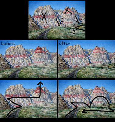
Art First Aid: Rainbow Ridge by Erin Hanson

Erin says: Ok, I should be paying you an artcentergraduate consulting fee... but do help me! it's like, i like the individual parts of the painting, but overall the composition is wrong or somethin...


I says: You're probably suffering from a twitchy eyeball brought about by the arbitrarily strong shapes and colors, which all fight discordantly for your attention. Your sensibilities are arguing with the design, which has enslaved your eyes. The eyes unconsciously obey the design they see first, then the brain tries to incorporate what it expects to see. Alas, in this case the eyeballs usually win.

The darkest part of the painting is the road, which draws you up to the darkest rock formation on the center left, which then immediately points your eye up and across the red horizontal band of the left peak, which leaves you at the big red triangle pointing clear off the top of the painting. This is the power of design, bright colors and high contrast draw the eye. It's like tumbling dominoes, one thing leads to another--which is good--you just did it accidentally.

So take back the design! Determine where you want the eye to go, and never encourage it to leave the painting. The viewer's eye should ping-pong around from one thing to another at your discretion and back again. NEVER just hope the viewer can decide what to look at first--always control the eye--heheh, unless it's a Where's Waldo.

1. I'd suggest that you dim out the scarlet in the two large mountains--the horizontal band and peak. REMEMBER! Atmospheric perspective pales and cools things as they go further back. The big strawberry sorbet peak must be robbed of a great deal of its majesty.

2. Then take the linear plunging shadows between the peaks and intensify them, especially at the very base of the foothills, in the grass. This teases the eye back down from wandering too far up the mountains and off into the sky.

3. Lastly, the lumpybumps at the center right-hand horizon line covered in grass need intensity. Given more contrast, they would form a left-facing arrow pointing back toward the bicyclists. All this together completes a clockwise optical journey from the bicyclists, over the peaks, down and across the grass and back down to the bikes. That's how you feel the ride, as well as see it. Oui?

Monday, September 17, 2007

Fops and Slobbers


This took me something like 3-4 hours to complete for the weekly exercise on http://artjumble.blogspot.com/ (so much fun!)

My refs are below, I get most of my imagery from http://corbis.com/ or http://veer.com/, and if I want to be really sneaky I hunt around on google images and steal from unwitting amateurs. Oh AND sometimes I shoot my own material. If I must.

Remember kids, copying someone else's work is infringement on their rights. This includes every medium and level of professionalism--Photographers and doodlers are people too. If you're going exhibit that sincerest form of flattery by robbing an artist blind, at least credit them where you can. I don't plan on making any money with this image, so hopefully that lets me off the hook.

And it's for edumacational purposes.


Friday, September 14, 2007

Vector vs. Raster, judged by the Norse gods

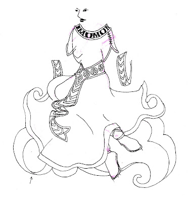
This was a project for FertileGoddess.com, one of several designs slated to adorn a new and improved line of yoga apparel. I drew the top half of Friia by hand and scanned her into Photoshop.

Freehand or Illustrator are better programs for this sort of work, being vector-based and lending themselves to clean lines. But scanners are raster-based to begin with and I'm lazy, so rather than scan it, redraw it, tweak it, I just put it into Photoshop at a high resolution and stay there. Do what I say, not as I do.


Vector Images are generated in illustration programs such as Illustrator or Freehand and are composed of geometry—lines, objects and fills. Because vector elements are mathematically defined, scaling to a larger or smaller size simply requires modification of their parameters. (Something computers love to do--math!) However, vector programs do not adapt well to photographic imagery at all.

Raster Images are broken down into a grid of digital picture elements, called pixels. Scanners, digital cameras, Painter and Photoshop are raster-based. While conversion from vector to raster is easily accomplished, raster to vector is much more hit and miss. (The way it's easy to draw a clean line and smudge it, but harder to un-smudge a once clean line.) Rasterized objects also don't take well to scaling, as the computer is much less adept at assuming and inventing arbitrary color.

SO! I sorta squiggled the dress and belt with the pen tool (using a mouse--I don't have a Wacom tablet either.) Then I printed her out again and traced some more stuff by hand, then scanned that...


THEN I went crazy on it in Photoshop, made some design decisions, thickened the lines and called it good. I sent it to my client, who loves everything I do. I am spoiled.


The End.